Interpreting the CDF and Thresholds Chart
Interpreting the Gumbel CDF and Threshold Chart
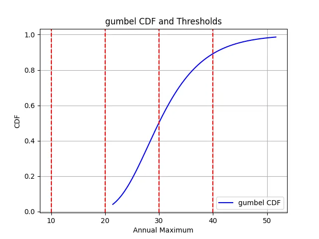
The attached figure presents a Cumulative Distribution Function (CDF) plot based on the Gumbel distribution fitted to a set of annual maximum values.
This type of analysis is commonly applied in extreme value theory,
especially when modeling the distribution of maxima (e.g., maximum daily temperature, peak discharge, highest rainfall, etc.) over fixed time periods such as years.
The x-axis of the chart represents the observed variable—in this case, annual maximum values of a climate or hydrologic indicator.
The y-axis shows the cumulative probability, ranging from 0 to 1. This indicates the probability that a random annual maximum observation from
the same population will be less than or equal to the corresponding x-value.
The blue curve is the fitted Gumbel CDF line. This curve increases smoothly from near-zero to near-one, reflecting the cumulative nature of probability.
A CDF, by definition, is a non-decreasing function, and the Gumbel distribution is particularly appropriate for modeling right-skewed data where large values are rare but impactful.
The red dashed vertical lines overlaid on the plot represent key thresholds of interest. These might correspond to:
- Fixed absolute thresholds (e.g., 10, 20, 30, 40, and 50 units), defined by the user based on domain expertise.
- Quantile or percentile thresholds (e.g., 90th percentile, 95th percentile), which identify exceedance probabilities useful in return period analysis or policy planning.
Let's Interpret the Plot
- Steepness of the Curve: The slope of the blue curve is steepest between the 20 to 40 range. This indicates that most annual maxima fall in this middle range. A steep slope in a CDF implies low variance and high concentration of data values.
- Left Tail (e.g., below 20): The curve rises slowly before this point, indicating that values less than 20 are rare. These are in the lower tail of the distribution.
- Right Tail (e.g., beyond 40): Similarly, the curve flattens out after 40, indicating that extreme values above this threshold are also rare but more impactful when they occur.
- Probability Interpretation: If you follow the x-axis to a threshold value of 30 and move vertically to the CDF line, then horizontally to the y-axis, you estimate the cumulative probability. If this maps to 0.55 on the y-axis, it means that ~55% of all annual maximum observations are ≤ 30.
- Risk Analysis: Thresholds that correspond to very high y-values (e.g., >0.9) are considered rarely exceeded. The return period (inverse of exceedance probability) becomes important here. For example, if the exceedance probability for a threshold of 45 is 0.05, the return period is 1/0.05 = 20 years.
- Decision-Making Use: This plot is valuable for climate scientists, civil engineers, and policymakers. For example, identifying what value corresponds to the 95th percentile can guide hazard warnings or infrastructure design standards.
- Goodness of Fit: A smooth and well-centered CDF curve that aligns with the empirical distribution suggests the Gumbel distribution is a good fit. This can be statistically validated using the KS test, Anderson-Darling test, and Q-Q plots.
In summary, this Gumbel CDF plot not only visualizes the spread and concentration of annual maximum values but also enables practical insights into threshold exceedance,
return periods, and probabilistic forecasting. The red dashed lines are key indicators for risk analysis, while the shape of the CDF offers clues about variability and tail behavior in the data.